Instant Project Dashboards for AequilibraE
Over the last two months, I have been interning with Outer Loop on the integration of web-based visualization …


Effective visualisation is critical for communicating the outputs of traffic forecasting models and studies, particularly to non-technical staff and the community at large. Traditional GIS and modelling software are incredible tools that can create powerful visualisations, but require significant skill to install and use, and don’t generally provide easily shareable artifacts. Because of this, modellers have long been stuck using these tools to process, format, and coerce model outputs into reports for more general consumption.
This is generally an inefficient use of modellers time and provides a flat and non-interactive product for the consumer. Moving this process to the web browser has long been considered an ideal solution, as it is a technology familiar to most people and does not require any additional software, but converting models (inputs and outputs) into online dashboards is still a time-consuming task, and thus not frequently undertaken in most modelling projects.
We decided to tackle making this process easier for AequilibraE as part of our involvement in the University of Queensland’s School of Mathematics and Physics Summer internship program. The solution we are working on leverages SimWrapper, a well known open-source software for building interactive maps, plots and dashboards for transportation and mobility data, and builds on it to enables users to display the contents of AequilibraE models and scenario analysis on the web with no data conversion and virtually no additional work.
Because SimWrapper runs in the browser, there’s no local setup: model files can be loaded and inspected directly, or dashboards can be defined with simple configuration files. And because it runs completely client-side, no user or model data is collected or uploaded, and no account is needed.
From this, we see two highly useful workflows that can be enabled:
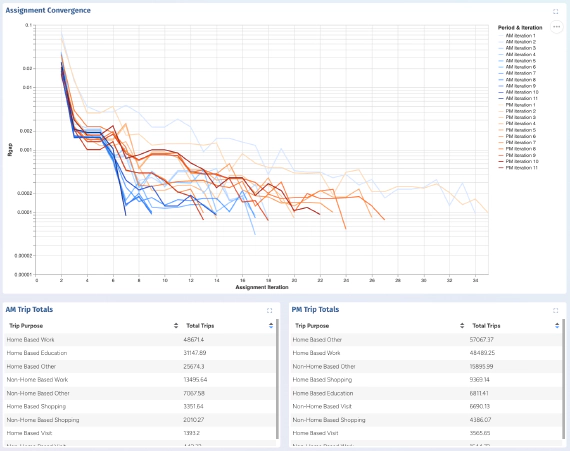
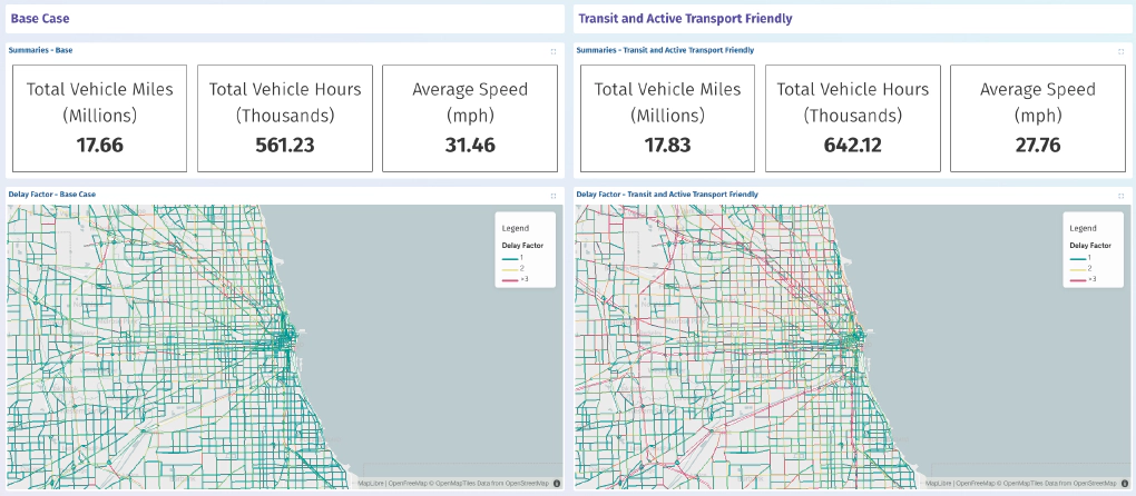
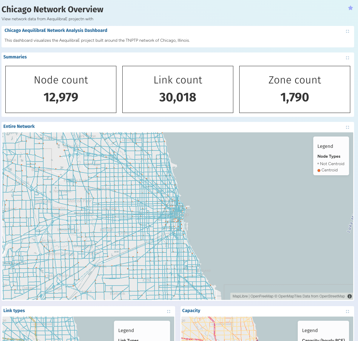
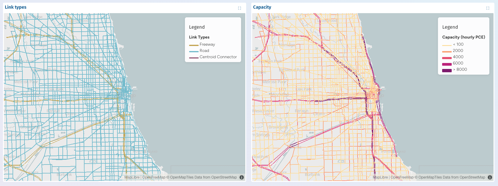
This can be seen in the demo project based on our Chicago model which is available at explore.outerloop.io. We welcome feedback for future enhancements, particularly around additional visualisations and richer comparison tools. Our goal is to make high-quality, interactive visualisations a natural part of the AequilibraE modeling cycle: fast to set up, easy to share, and robust enough to support all stages of planning and modelling, from study setup to decision-making.
Out of the box, SimWrapper was a capable tool but missed two key features that we need to provide a seamless integration between AequilibraE and SimWrapper:
To bridge this gap we have developed a new plugin for SimWrapper that should soon be merged into the official version. Under the hood, the AequilibraE reader understands typical project structures and attributes (e.g., links, zones, skims, assignment results), so common outputs are immediately visualisable without manual preprocessing.
We have also added AWS S3 bucket support to SimWrapper, enabling centralised storage and seamless sharing of models and their interactive visualisations. Teams may publish new runs or scenarios directly to cloud buckets, with dashboards automatically reflecting changes.
Over the remainder of the internship project we are going to be focussing on expanding the capabilities demonstrated here and further reducing the friction of publishing model results to the web.
Over the last two months, I have been interning with Outer Loop on the integration of web-based visualization …

Over the past 8 weeks we – Evelyn Bond and Tyler Pearn – have been working with Outer Loop as part of the University of …
